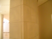
I went to the Burchfield Penny Art Gallery for this assignment. This assignment was a little different that the last one because I had to focus on space, architecture and lighting. There we two major types of lighting in this gallery. The front of the gallery used a lot of natural lighting from the ceiling as well as some big windows found throughout the gallery. For the most part threw the gallery there were individual lights pointing on the pictures. The walls were white for the more modern art and dark grey in the rooms with the older collections. I noticed several pillars in the middle of the buildings and beautiful wooden staircases for some of the architecture. The museum was set up so that it flowed for you to walk through. There wasn’t much option as to which direction to go, it seemed to me that it was designed for you to walk a certain way. One thing I did notice as far as space is that the ceilings were extremely high. Some of the rooms had works of art hanging from the center from the high ceilings. The art work was for the most part evenly spaced out. I thought it was odd that some of the art work was hung so high that you really good not get a good look to analyze and interpret it. Most of the artwork was not individually labeled. The name of the artist would be on the wall and sometimes there would be one sign for all the artworks. Most of the modern art work did not have frames. The room with the older artwork had old elaborate bronze thick frames. I feel the gallery can be broken into old and new. The older artworks were similar in that they contained usually a self portrait or a picture related to wars going on. They differed in that they picked different topics on wartime to focus on. The modern art in the gallery different because some of it was three dimensional, some of the artwork was photography. Other consisted of collages and some were drawings and paintings. Each room had a specific theme. The proximity of the artwork varied in different parts of the museum. Some rooms only had one picture on a wall, usually in the center. Other walls contained pictures evenly spread out, one following the other. The artworks that hung from the ceiling generally were in the center of the room. One of the exhibitions I passed was the exhibition cabinetry design. There was a lot of pottery and plates in the cabinets with war themese painted on them.
In this water color painting I see a house that is extremely old. To the side of the house there is a barn. Both the house and the barn are surrounded by trees. With in the trees there is an owl. There is a wide open feild with trees further in the background. This painting by Charles Burchfeild is not a realistic one. This paitning reminds me of something scary. Burchfeild uses space to empahsize the house. He also uses colors that depict old and frightening tones. The trees do not appear to be in proportion to the house.
This spray painting is of a garbage pile. There is a pond in the front that shows the refelction. This very well could exist in real life. The artist uses rythm and repeats the same thing over. He also uses light in the reflection of the pond to empahize how large it really is. He also uses dull colors to show how the site is gloomy. I think the artist is trying to get you to realize how much garbage there can be found everywhere and I feel that this painting is effective. I think the medium of spraypaint that was used also represents clutter and filth becuase of the negative image spray paint carries.
This particular artwork is literally just a hermit crab on top of a rocket ship. This artwork is inside a cage with out a top, almost like a crib.( didn't capture the whole picture in my image) The artist choose all white ceramic for this artwork. This can symbolize the symblicity of the message she is trying to convey. The symbolism beheind this is that a person or hermit crab is often viewed to be from another world. I believe this is what the artist is trying to get across. This sculture is one of three in the exhbit that have similar meanings about people who are seen as hermit crabs. The sculpture is placed in side an empty cage with nothing around it. The space also emphasizes the simplicity.


No comments:
Post a Comment